The wait is over! Next year’s hotly anticipated Color of the Year by Pantone is—drum roll, please—Ultra Violet. More progressive and provocative than trendy Millennial Pink, according to Pantone this distinct shade of purple “communicates originality, ingenuity, and visionary thinking that points us toward the future.”
At Storyblocks we like to stay abreast of the biggest trends impacting the creative community, like our 2020 Trends Guide, so we’ve rounded up all the facts you need to know about PANTONE 18-3838 (aka Ultra Violet). Here’s what this trendsetting and innovative color means for creatives.
Pantone’s Ultra-Violet Color Values

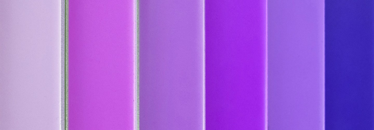
Download this ultra violet photo.
Name: Ultra Violet, PANTONE 18-3838
Hex: 5F4B8B
RGB: 95, 75, 139
CMYK: 32, 46, 0, 45
*Note that Pantone does not provide exact CMYK values for Ultra Violet; CMYK values are approximate
Looking for photos or vectors featuring 2018’s hottest color? Explore our collection of royalty-free Ultra Violet images.
What Pantone Says About the Color
“Enigmatic purples have also long been symbolic of counterculture, unconventionality, and artistic brilliance. Musical icons Prince, David Bowie, and Jimi Hendrix brought shades of Ultra Violet to the forefront of western pop culture as personal expressions of individuality. Nuanced and full of emotion, the depth of PANTONE 18-3838 Ultra Violet symbolizes experimentation and non-conformity, spurring individuals to imagine their unique mark on the world, and push boundaries through creative outlets.”
View the full announcement from Pantone here.
Looking for footage, motion backgrounds, or After Effect templates featuring PANTONE 18-3838? Explore our collection of royalty-free Ultra Violet clips.
What It Means
As Pantone notes, purple stands for inspiration, creativity, and thinking outside the box—all themes that the trendcasters are anticipating for the coming year. After more than twelve months of polarizing news headlines and global tragedies, Pantone chose a color that not only signals new insights and optimism, but also a practical, problem-solving outlook. In short, these are not the Rose Gold colored glasses of recent years, but rather inspiration that is linked to action—or activism. For creatives, this means being willing to go boldly and push back against accepted norms or practices.
Stylistically and design-wise, it also means that there’s an emphasis on energy after several years of subtle introspection with 2017’s Greenery and 2016’s Serenity and Rose Quartz. This investment in action means that bold contrasts, duo- or tri-tones, and dynamic compositions will take the stage—in both minimalist and maximalist settings.

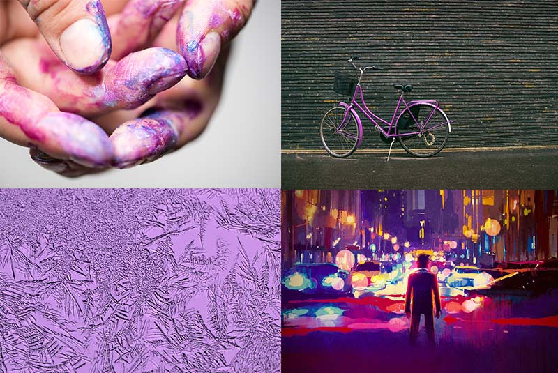
Download these images from our Ultra Violet collection.
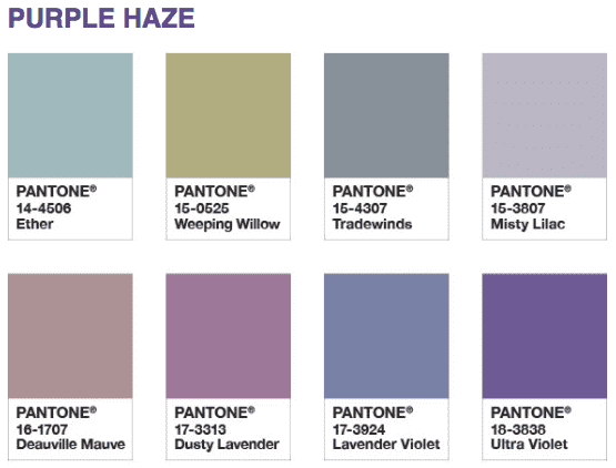
At the same time, as forward-looking as Pantone’s color choice is, it’s also a clear homage to several of the recent cultural icons we’ve lost. Invoking nostalgic pop legends like Prince, Bowie, and Hendrix, Pantone even went so far as to name one of its recommended palettes “Purple Haze.”

See more Pantone recommended palettes for Ultra Violet here.
This tongue-in-cheek gesture towards iconoclasts of the past suggest that Ultra Violet isn’t solely about forging new paths alone but rather about bridging—and healing—the gap between our fractured histories and our imagined, rebellious futures.
So how about it? Are you feeling inspired by PANTONE 18-3838? Don’t forget to explore our Ultra Violet video and image collections—or discover more of 2018’s up and coming trends with our Essential Trends Guide.


